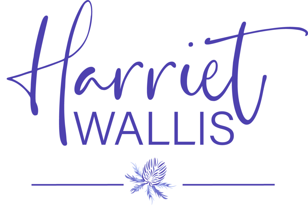
Why the thistle?
I recently decided on a little re-brand. I talked about it in my blog about my new look website.
So how did I go about a re-brand?
For me, it was actually quite simple. I’ve always loved thistles. The blues and the purples in the colours are striking and yet raw and natural looking.
These are the colours I wanted to base my branding colour palette on. I then Googled what a thistle represented. This is the part that sealed it for me. Thistles represent strength, determination and resilience. These are values I reaffirmed during the business course I completed with my coach Donna Hann over the summer.
Coming into alignment:
So now I had my colours, my reasons for choosing them and my business values all aligned. I then chose the strap line “make your mark” because at the end of the day, we all just want to make our mark in the world, whether that’s in business, life, personally or professionally. When Evie, my branding guru put it all together for me, the thistle logo looked like a stamp. I imagined stamping it onto a document, like I was making my mark.

I now love my logo, my strap lines and my colours. I have a branded website, business cards and flyers I am proud to share! It all feels right in regards to what I want in business and how I want to appear to others.

If you would like any help in establishing your branding, I can’t recommend Evie enough. If you would like some support in establishing goals and values for your business and how your branding can reflect that. Please do book in a discovery call with me via the contact page.